YouTube Shorts finally have custom thumbnails.
And almost nobody is using them properly.
For years, Shorts creators were stuck with whatever random frame YouTube auto-selected. Your video could be amazing, but if the thumbnail was a blurry mid-sentence face? Good luck getting clicks.
Now you can upload custom thumbnails for every Short. This is a massive deal. And the creators who figure out thumbnails first are going to eat.
Here's how to make YouTube Shorts thumbnails that actually get people to tap.
Why Shorts Thumbnails Matter More Than You Think
"But Shorts auto-play in the feed. People don't click thumbnails."
Wrong. Here's where Shorts thumbnails actually show up:
- YouTube Search results - when someone searches a topic and Shorts appear
- Your channel page - when someone visits your profile and browses your Shorts tab
- Suggested Shorts shelf - the horizontal scroll on the YouTube homepage
- Subscription feed - when subscribers browse their feed on desktop
- Google Search - Shorts now appear in Google search results with thumbnails
- Notifications - push notifications show the thumbnail
The Shorts feed (vertical swipe) is the only place thumbnails DON'T matter. In every other discovery surface, your thumbnail is the first thing people see.
And those "other surfaces" account for a significant chunk of Shorts views. Creators with optimized thumbnails report 20-40% more views from search and suggested compared to auto-generated thumbnails.
That's not a small difference. That's the difference between a video dying at 10K views and one that keeps getting discovered for months.
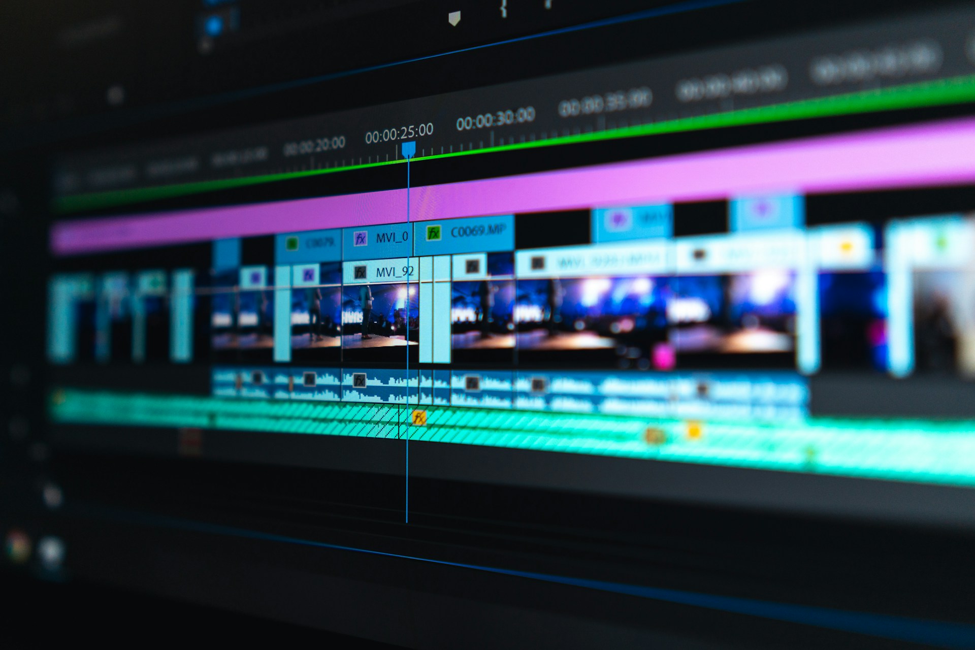
How to Set a Custom Thumbnail on YouTube Shorts
The process is simple:
On mobile (YouTube app):
- Upload your Short as normal
- Before publishing, tap Edit thumbnail
- Choose a frame from the video OR upload a custom image
- Crop and adjust
- Publish
On desktop (YouTube Studio):
- Upload your Short
- In the details page, click the thumbnail section
- Upload a custom image or select a frame
- Save and publish
For existing Shorts:
- Go to YouTube Studio > Content > Shorts
- Click the Short you want to update
- Click the thumbnail and upload a new one
- Save
Thumbnail specs:
| Spec | Requirement |
|---|---|
| Resolution | 1080 x 1920 pixels (9:16 aspect ratio) |
| File format | JPG, PNG, or GIF (static) |
| File size | Under 2MB |
| Content | Must follow YouTube's thumbnail policies (no misleading content, no graphic imagery) |
Unlike regular YouTube video thumbnails (16:9), Shorts thumbnails are vertical (9:16) to match the Shorts format. Don't upload a horizontal thumbnail. It'll get cropped badly.
The 5 Thumbnail Styles That Get the Most Clicks
After analyzing top-performing Shorts channels in 2026, five thumbnail styles consistently outperform everything else.
Style 1: The Bold Text Overlay
A single, bold statement on a clean background or over a relevant image.
What it looks like:
- 3-7 words MAX
- Massive font (readable at thumbnail size)
- High contrast colors (white text on dark background, or yellow/red text on any background)
- The text creates curiosity or states a shocking fact
Works best for: How-to content, tips, facts, educational Shorts
Example text:
- "This hack saves 3 hours"
- "Stop doing this on TikTok"
- "The $0 marketing strategy"
Style 2: The Reaction Face
A close-up face showing extreme emotion (shock, confusion, excitement) with minimal text.
What it looks like:
- Face takes up 60-70% of the thumbnail
- Exaggerated expression
- Optional: 1-3 words of text
- Bright, saturated colors
Works best for: Reaction content, story time, opinion videos, commentary
Humans are wired to look at faces. A shocked face with wide eyes and an open mouth gets clicked more than almost anything else. It's not subtle. It's not sophisticated. But it works.
Style 3: The Before/After Split
Two images side by side (or top/bottom) showing a transformation.
What it looks like:
- Left = "before" (ugly, messy, broken)
- Right = "after" (beautiful, clean, fixed)
- Arrow or dividing line between them
- Optional: "Before" and "After" labels
Works best for: Transformation content, tutorials, makeovers, editing showcases
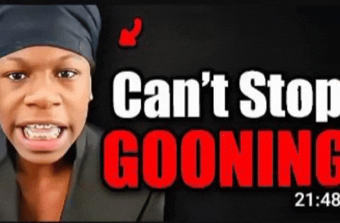
Style 4: The Mystery/Curiosity Gap
A thumbnail that shows something intriguing but doesn't reveal the answer.
What it looks like:
- A blurred or partially hidden element
- Red circle or arrow pointing at something
- Text like "Wait for it..." or "Look closer"
- A question mark
Works best for: Reveal content, "you won't believe this" content, hidden details
Style 5: The Clean Minimal
Simple, professional, branded. Think Apple-level minimalism.
What it looks like:
- Solid color background
- One object or icon
- Clean typography
- Your brand colors consistently
Works best for: Faceless channels, educational content, branded series
Want to skip the editing?
GhostShorts turns your ideas into viral shorts with AI voiceovers, captions, and gameplay clips. Ready to post in minutes.
Try GhostShorts TodayThe 7 Rules of High-Converting Shorts Thumbnails
Regardless of which style you use, follow these rules.
Rule 1: Readable at Thumbnail Size
Pull up your thumbnail on your phone. Shrink it to the size it'll actually appear in search results or on your channel page.
Can you read the text? Can you tell what's happening?
If not, simplify. Bigger text. Fewer elements. More contrast.
The #1 thumbnail mistake is putting too much stuff in the image. A Shorts thumbnail is tiny, especially on mobile. You get ONE focal point. Make it count.
Rule 2: Use Contrasting Colors
Your thumbnail is competing with hundreds of other videos on the screen. It needs to POP.
The most clickable color combinations:
| Background | Text/Foreground |
|---|---|
| Dark blue/black | Yellow or white |
| Red | White |
| Bright yellow | Black |
| Green | White |
| Purple | White or yellow |
Avoid low-contrast combos like light gray on white or dark blue on black. They disappear at small sizes.
Rule 3: Create a Curiosity Gap
The best thumbnails make you NEED to tap. They show enough to intrigue but not enough to satisfy.
Good: A thumbnail showing a person holding a mysterious object with text "This changed everything" Bad: A thumbnail that shows the entire result, so there's no reason to watch
Think of your thumbnail as the hook, not the punchline.
Rule 4: Match the Thumbnail to the Content
Clickbait thumbnails that don't deliver will destroy your channel. YouTube tracks viewer satisfaction. If people click your thumbnail and immediately swipe away, YouTube will stop showing your Shorts to new people.
Your thumbnail should accurately represent what the viewer will see. Just make it look as interesting as possible.
Rule 5: Use Faces When Possible
Even for faceless channels, incorporating a face (even a stock photo or illustration) increases click-through rates. Human brains are hardwired to notice faces before anything else.
If you're running a faceless channel, consider using:
- Illustrated characters
- AI-generated faces
- Emoji faces
- Reaction images
Rule 6: Stay Consistent With Your Brand
Use the same colors, fonts, and layout style across all your thumbnails. When someone visits your channel page, your Shorts grid should look cohesive. Like a brand, not a random collection.
Pick 2-3 colors. Pick 1 font. Stick with them.
This builds recognition. After a while, people will spot YOUR thumbnails in their feed without even reading the text.
Rule 7: Test and Iterate
YouTube now shows you click-through rate (CTR) data for Shorts in YouTube Studio. Use it.
Check which thumbnails get the highest CTR. Look for patterns. Then do more of what works.
A good Shorts thumbnail CTR is 3-6%. Above 8% and you're crushing it. Below 2% and your thumbnails need a complete overhaul.
How to Make Thumbnails Fast (Without Being a Designer)
You don't need Photoshop. Here are the fastest ways to create Shorts thumbnails in 2026:
Canva (Free)
- Pre-made YouTube Shorts thumbnail templates
- Drag and drop, change text, export
- 2-3 minutes per thumbnail
CapCut (Free)
- Built-in thumbnail creator when you export a Short
- Basic but functional
Adobe Express (Free tier)
- More design control than Canva
- Great for branded, professional-looking thumbnails
Screenshot from your video
- Sometimes the best thumbnail is just a well-chosen frame from your actual video
- Take a screenshot of the most visually interesting moment
- Add text overlay in Canva or your phone's photo editor
Batch creation method:
- Create ONE template in Canva with your brand colors and font
- Duplicate it for each new Short
- Just swap the text and background image
- Export all of them at once
This takes about 1-2 minutes per thumbnail once you have the template. If you're posting 5-7 Shorts per week, that's 10-15 minutes total. No excuses.
Thumbnails for Faceless Shorts Channels
If you're running a faceless channel making Reddit story videos, fake text videos, top 5 countdown videos, or other faceless formats, thumbnails matter even more.
Why? Because you don't have a recognizable face to build familiarity. Your thumbnail IS your brand identity.
Best practices for faceless channel thumbnails:
- Use a consistent color scheme across every thumbnail
- Create a recognizable "frame" or border that's uniquely yours
- Use text-heavy thumbnails since you can't rely on facial expressions
- Include your channel name or logo subtly on each one
- Use bold, dramatic text that matches the video topic
For example, if you're making Reddit story videos with GhostShorts, your thumbnail might be a dark background with bold white text teasing the story: "My neighbor's secret was worse than I thought." Consistent frame. Consistent font. Instantly recognizable.
Common Thumbnail Mistakes (And How to Fix Them)
Mistake 1: Too much text Fix: Maximum 7 words. If you need more, it's too much.
Mistake 2: Using the auto-generated thumbnail Fix: Always upload a custom thumbnail. Even a screenshot with text overlay is better than a random frame.
Mistake 3: Horizontal thumbnails on Shorts Fix: Always design in 9:16 (1080x1920). Horizontal images get cropped terribly.
Mistake 4: Tiny, unreadable text Fix: Your text should be readable on a phone screen at the smallest size the thumbnail appears. Test it.
Mistake 5: No consistency across videos Fix: Use a template. Same colors, same font, same layout.
Mistake 6: Ignoring CTR data Fix: Check YouTube Studio weekly. Compare CTR across your Shorts. Find what's working.
Mistake 7: Spending 30 minutes per thumbnail Fix: Template it. 2 minutes max. Your time is better spent making more content.
Thumbnail A/B Testing on YouTube
YouTube has been rolling out thumbnail A/B testing (called Test & Compare) to more creators throughout 2026.
If you have access:
- Upload 2-3 different thumbnail options for the same Short
- YouTube will show each version to a portion of your audience
- After a few days, YouTube picks the winner based on CTR and watch time
- The winning thumbnail stays
This is incredibly valuable. Instead of guessing which thumbnail works better, you let the data decide.
Even if you don't have A/B testing access yet, you can manually test by uploading a thumbnail, checking CTR after 48 hours, then swapping it with a different version and comparing.
The Bottom Line
YouTube Shorts thumbnails are the most underused growth lever in 2026.
Most creators still use auto-generated thumbnails. Most of those thumbnails are terrible.
Here's your checklist:
- Design in 9:16 (1080x1920)
- Use one of the 5 proven styles
- Keep text to 7 words or fewer
- Make it readable at tiny sizes
- Stay consistent with your brand
- Check CTR data weekly
- Use templates to save time
Do this for your next 10 Shorts and watch what happens to your views from search and suggested. The difference is real.
Your content deserves a good first impression. Give it one.